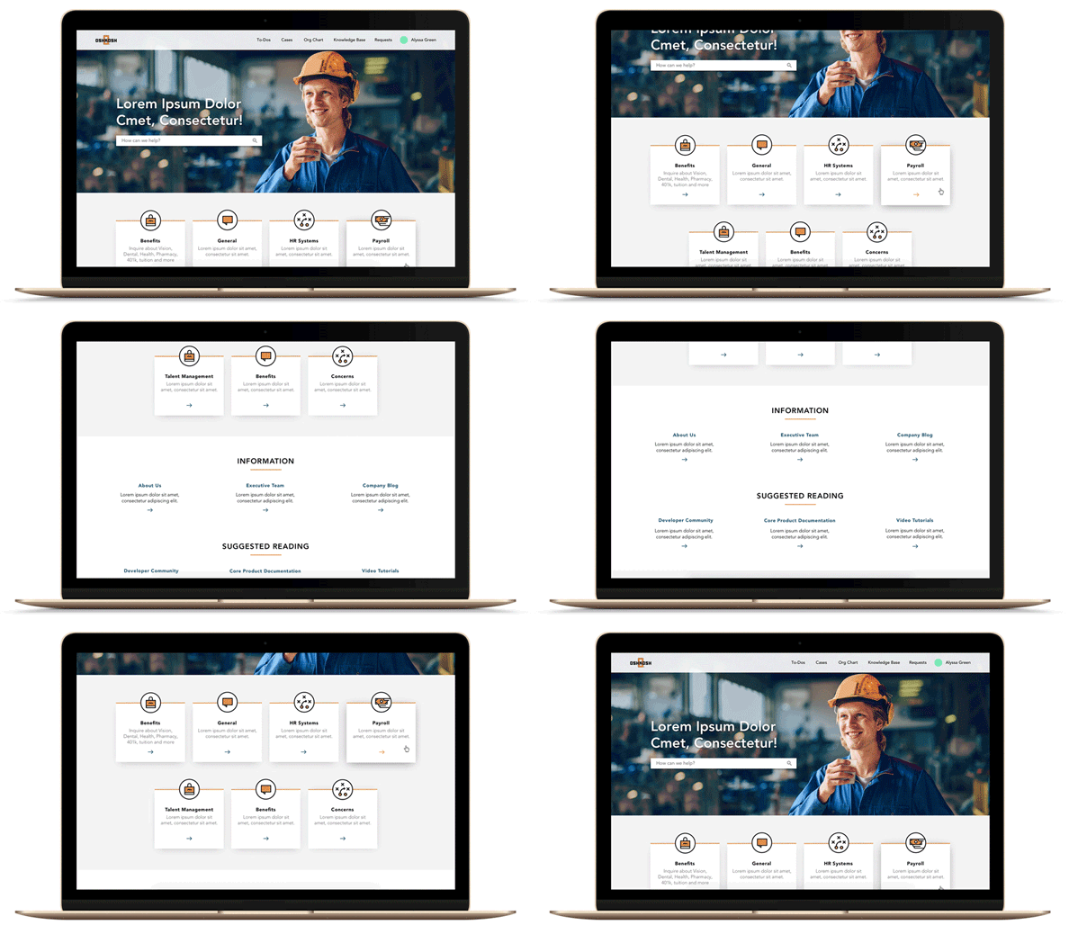
Oshkosh HR Portal Redesign
Oshkosh Corporation partnered with VSA Partners to transform their HR Portal into a dynamic driver of employee experience. With a focus on seamless integration with Workday and a user-friendly interface accessible on both desktop and mobile, the project aimed to centralize HR information while enhancing usability and functionality.
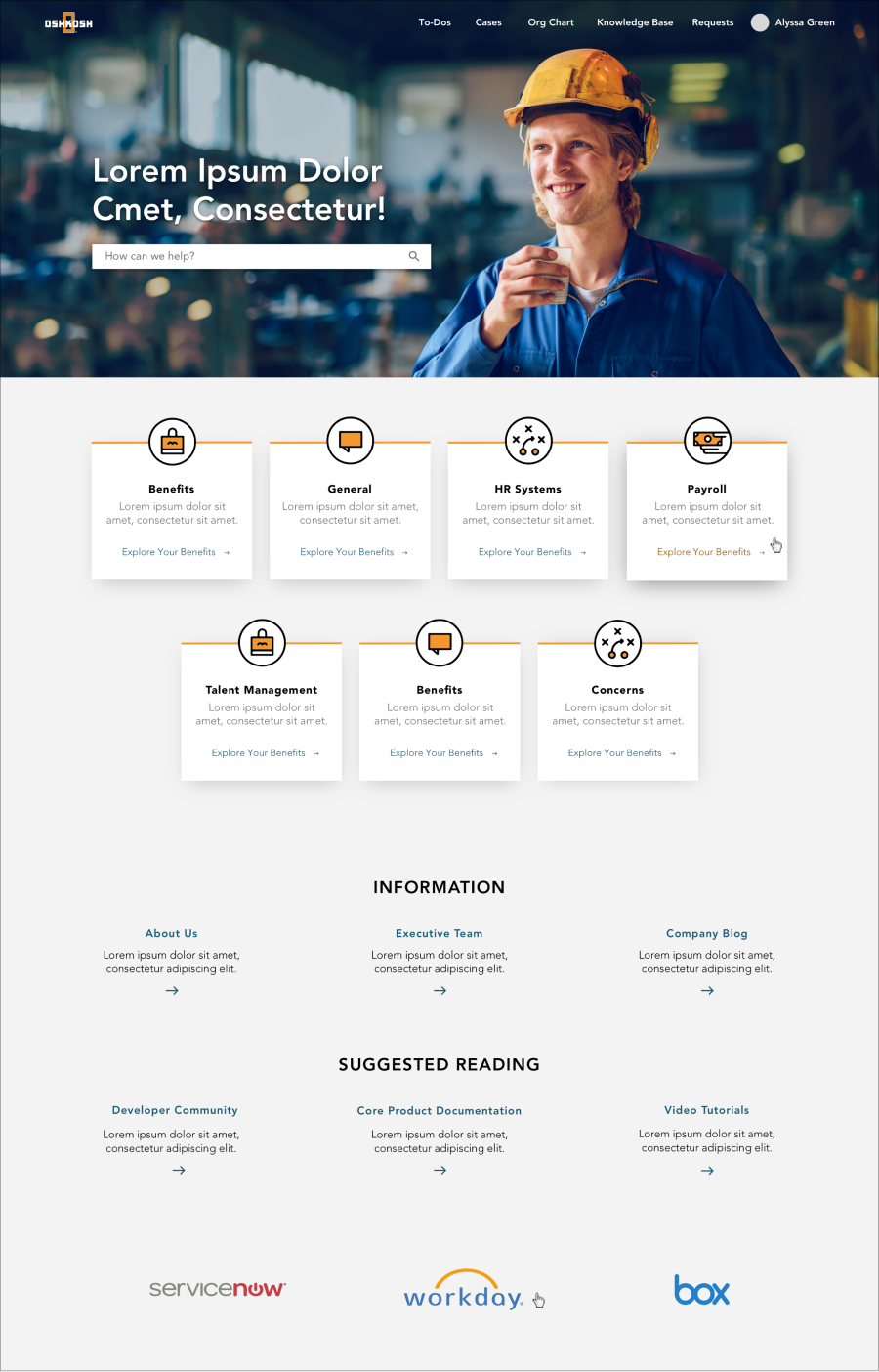
As an Interaction Designer Intern at VSA Partners, I played a pivotal leadership role in Oshkosh Corporation's HR Portal redesign project. Tasked with presenting design iterations to clients independently at various project stages, I focused on transforming the portal into a user-centric hub for accessing HR information seamlessly integrated with Workday. Additionally, I spearheaded the creation of a user-friendly landing page directing users to Workday data or external resources, ensuring optimal accessibility across desktop and mobile platforms while adhering to the brand design system.
Client
Oshkosh Corporation
Year
2018
My Role
UX/UI Designer (Intern)
Initial State
Initially, the portal relied on a standard design provided by Workday, lacking customization to align with the distinctive branding of Oshkosh Corporation. This generic template failed to capture the essence of Oshkosh's identity and did not reflect the company's values or aesthetics. Therefore, there was a crucial need to overhaul the design to create a cohesive and branded experience for employees accessing HR information through the portal.
Research
Collaborating closely, a senior designer and I conducted multiple interviews with Oshkosh employees, guided by a shared objective: to glean deep insights into their perceptions of the company. This approach empowered us to craft a design that authentically mirrors their perspectives, thus contributing to the enhancement of their overall experience. Throughout the process, we remained focused on our inquiries, diligently seeking answers that would inform our design decisions:
What’s the essence or intent we’re trying to communicate?
That the portal is a better way to serve Oshkosh employees with current, relevant information and HR resources in one centralized location: It’s a streamlined experience tailored to you.
What emotions, tone, or impressions should the experience evoke?
Unifying: Regardless of business unit or sub-brand, team members should feel like a part of the Oshkosh family. Supportive: We want them to feel like Oshkosh is supporting them in their every day, providing them with relevant information exactly when needed.
Human: Everything should feel intuitive and personalized like the portal was built with the individual in mind. This portal will be positioned as the place to get answers, not another/new system employees must learn how to use. Accessible: It should feel like an extension of HR, accessible anytime from anywhere.
Design
Recognizing the constraints imposed by the technical limitations of the ServiceNow platform, I strategically leveraged available design elements such as the color palette, icons, photography, and typography. Despite the platform's restricted flexibility in terms of grid systems and layouts, I maximized the utilization of accessible resources to ensure a cohesive and visually appealing design.
I created a compact and simple design system for the developers at Oshkosh, enabling their internal digital team to easily make future changes when necessary.


